Understanding Global Emissions (& the inherent inequality) in Seven Charts
Who is causing climate change, who is being short-changed and who has to fix it?
Welcome to the 13th issue of Climate Matters, I’m back with another long analysis that should be very insightful in terms of understanding where our energies are best spent for maximum impact.
First time here on Climate Matters? Why not sign up for weekly articles on all things Climate Change in your inbox!
Gun to your head, no practical or ideological restrictions, you’re asked to do one thing on behalf of the whole world to avert climate crisis, what will you choose?
I asked this question on my Instagram and the responses were not way off the mark from what needs to be done. A sampling below.
“Grow my own food” / “Restore natural ecosystem” / “Stop all infrastructure projects and remove dams” / “Change corrupt government officials and put scientists there” / “Seize all share markets” / “Transition to 100% renewable energy” / “Blanket ban on Coal” / “Hold oil and gas accountable” / “Make noise about climate crisis day in and day out” / “Get into politics” / “Redesign economics” / “Go back in time & learn, act, educate”
But my biggest takeaway was that it wasn’t immediately clear to many what the biggest driver of climate change is and what would be the most effective action to avert climate crisis.
And so, in this week’s issue let’s take a deep dive to explore where our emissions come from and figure out where our efforts are best spent if we have to achieve optimal result.
Climate change isn’t a difficult problem to understand. Humans discovered burning fossil fuels and prospered rather spectacularly in a record time in all of human history. But turns out fossil fuels not only drives development but also ratchets up the heat through greenhouse gas emissions. Today we know our meteoric growth has dire consequences and we’re all scrambling to avert the crisis with minimal damage.
By now we also know we need to reduce emissions immediately, but do we know where to concentrate our efforts to have maximum impact?
Let’s dive into the emissions breakup then!
1. Sector wise emissions - aka which sector do we need to focus on?
Global greenhouse gas breakup by sector for our emissions in the year 2016. Source: Our World in Data
Energy is the single biggest source of our greenhouse gas emissions at 73.2%. This shouldn’t come as any surprise because we burn fossil fuels mainly to produce electricity and to fuel our transport and industries. And to reduce greenhouse gas emissions, we must stop burning fossil fuels. Good news is that we have alternate energy sources readily available. While some sectors may be hard to decarbonise[*] like aviation for instance, replacing a large percentage of fossil fuel powered energy with renewable energy today isn’t that hard if there is enough political will.
Explore sector by sector greenhouse gas emissions in detail here.
2. Historical emissions - aka who’s responsible for today’s warming?
Cumulative, historical emissions per country, measured from 1751 to 2017. Source: Our World in Data
India and China are often portrayed as the big villains derailing global climate action by continuing to invest in coal but are they to be blamed for today’s warming? First, carbon dioxide stays in the atmosphere for tens to hundreds of years. This means the warming we’re seeing today is a result of CO2 getting accumulated in the atmosphere for the whole of last century. So who put all those emissions in the atmosphere?
Imagine a bucket being filled with water. When the bucket finally overflows, are the ones who filled it to the brim responsible for overflowing or those who added the last two jugs of water responsible for the overflow? India and China are the last two jugs in this scenario. The bucket was mainly filled by United States of America(25%) and Europe(33%) to the brim. China’s cumulative emissions till 2017 only account for 12.7% and India accounts for a minuscule 3%.
It then follows that those who caused the problem should do the most to solve the problem today. Explore cumulative emissions in detail here.
3. Future emissions - aka who’ll be responsible for tomorrow’s warming?
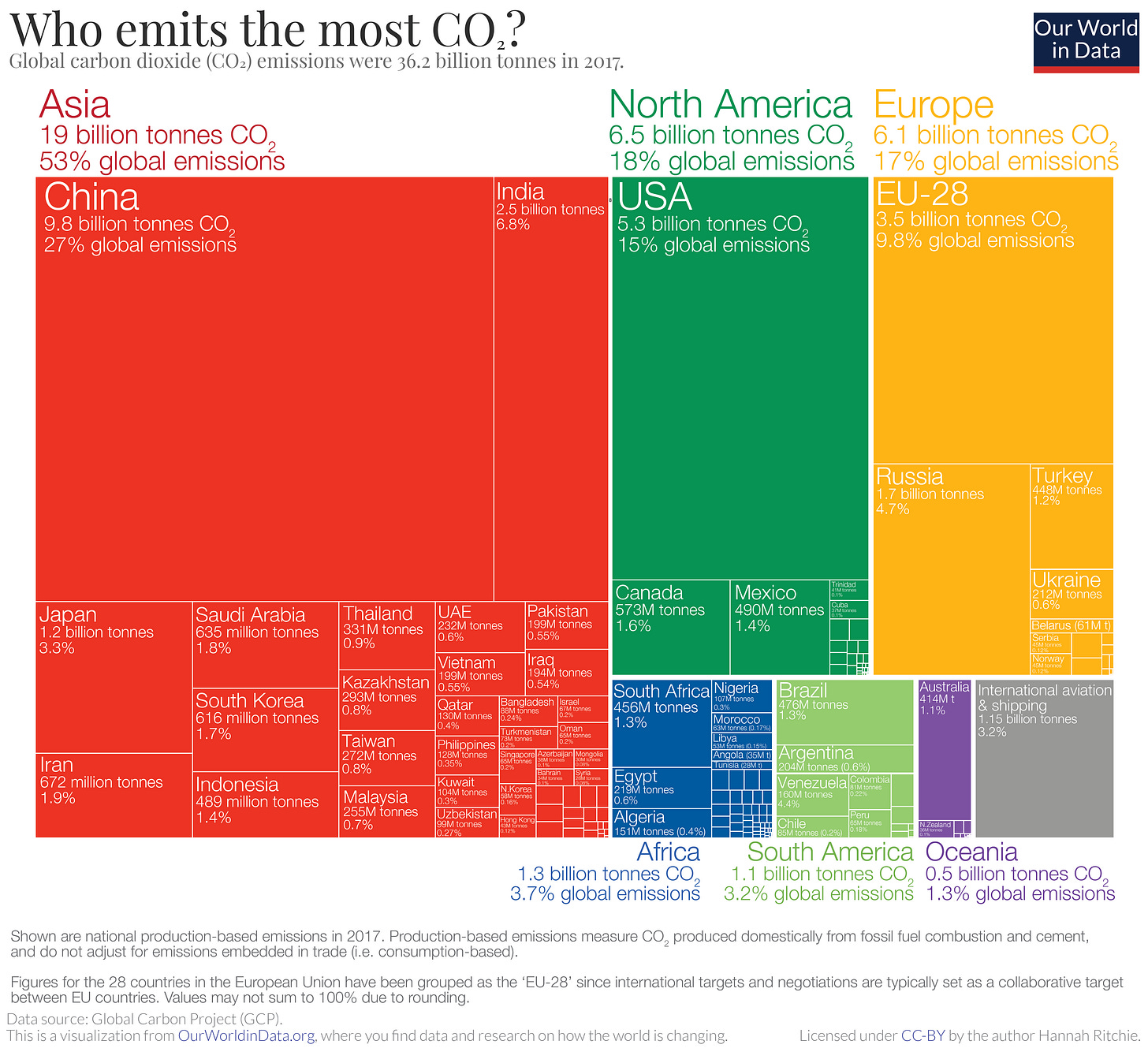
Current annual fossil fuel emissions breakup per country for the year 2017. Source: Our World in Data
While India, China and other emerging economies are not responsible for current warming, they will be responsible for future warming along with some other developed countries like the US and Australia that refuse[*] to reduce emissions proportionate to their past emissions as of now. Developing countries then have two choices.
Developing countries’ rightful and fair share of carbon budget has been extinguished by a few countries in the Global North (comprising 10 developed, high-income countries and Europe). So morally, one could argue that developing countries then don’t need to mitigate emissions fast enough and instead developed countries should mitigate drastically, freeing up enough carbon budget that can now be used by developing countries. The advantage here is that developing countries then don’t have to wait on technological or financial assistance to develop without fossil fuels and take the tested path to prosperity like the developed world did. The disadvantage here is that any amount of extra carbon dioxide put in the atmosphere puts the immediate next generation globally at great peril, increasing the risk of warming and associated cascading impacts exponentially.
The other option is that developing countries can leverage the technological advancements in renewable energy and claim financial and technological assistance from developed countries. We can then channel this to prosper using green energy and adapt to climate change at the same time. This way, we will also have a moral high ground to demand developed countries reduce their emissions in proportion to the damage caused. The advantage here is that global emissions will reduce, which is very good news for us and the next generation because less emissions mean less warming and lesser associated climate disruptions. The disadvantage here is that the energy transition to renewables isn’t as straightforward and involves valid risks, challenges and uncertainties at our current technological standing.
The way ahead for developing countries lies somewhere between these two options and it remains to be seen how the decarbonisation and development of Global South progresses over the next decade. Explore current annual emissions in detail here.
4. Country wise per capita emissions - aka who needs to reduce their personal emissions?
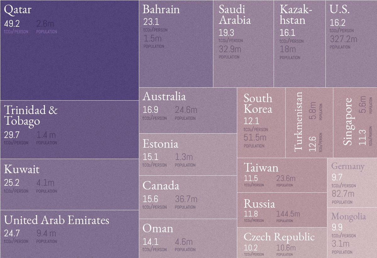
Source: Top 20 countries with highest per capita emissions in 2017 via Visual Capitalist
Much ado has been made of reducing individual carbon footprints and taking personal responsibility in the fight against climate change. But are all our carbon footprints the same?
Here are some reasons why per capita emissions can be high -
If they are in oil/gas/coal rich countries
If the country population size is low
If the energy consumption is high
In the chart above, you’ll notice major oil producing countries are one of the world’s highest per capita emitters, naturally. But surprisingly, countries like Trinidad & Tobago and Mongolia also find a place in the top 20 list. This is because of the low population and high reliance on oil/gas/coal, we don’t have to read much into it as it does not amount to much in the global tally.
But what we need to focus on are countries with high population and high energy consumption like the US, Saudi Arabia, South Korea, Australia, Germany, Russia etc. The high population coupled with high energy consumption means these country emissions are significantly higher and any reduction in per capita emissions here could actually translate to reasonable gains in terms of overall emissions reduction.
In 2017, the global average per capita emissions was 4.8 tonnes per person. In India, per capita emissions was 1.84 tonnes while the US was at 16.2 tonnes, South Korea at 12.45 tonnes, Germany at 9.65 tonnes and Australia was at 17 tonnes per person.[*]
This highlights the vast inequalities in per capita emissions around the world and gives an idea on where it might be a worthwhile exercise to reduce individual carbon footprint and where it might be better to focus on energy transition instead. Explore per capita emissions in detail here.
5. Corporate emissions - aka which companies screwed us over?
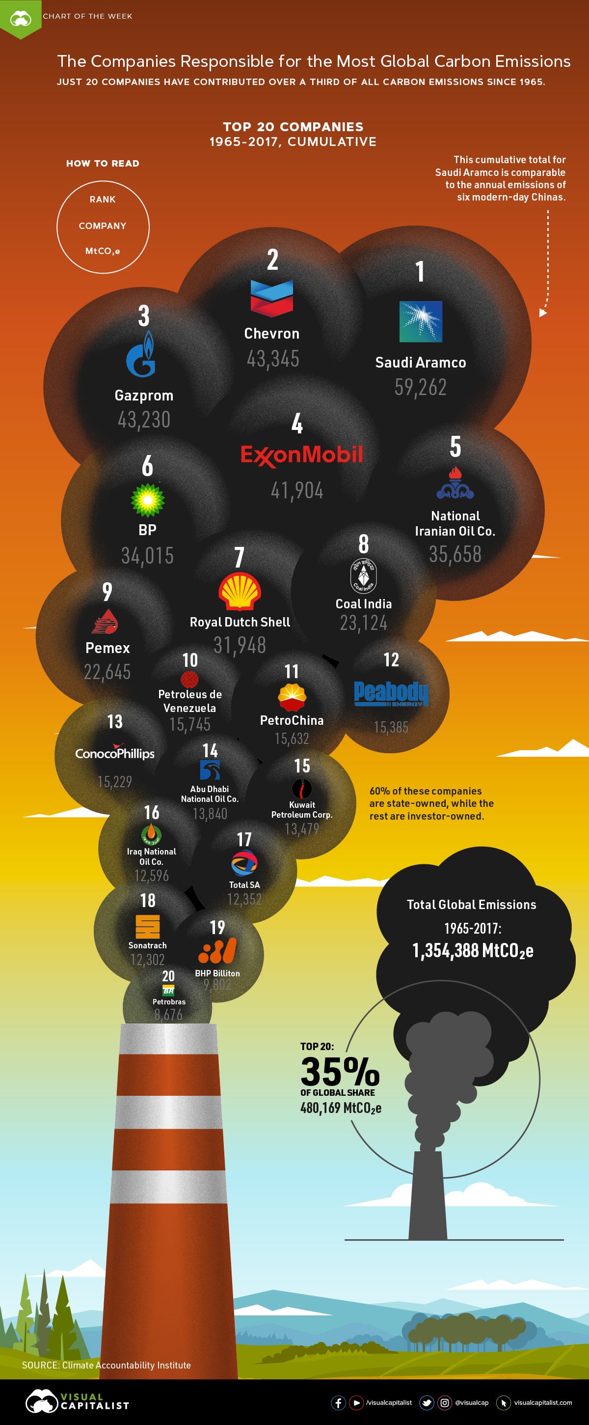
Top 20 companies responsible for 35% of all emissions between 1965 and 2017. Source: Visual Capitalist*/Climate Accountability Institute.
Now this one stings the most. Fossil fuels companies knew[*] that burning fossil fuels causes global warming that will mess with our climate system and yet they lobbied hard to sway policies in their favor[*], discredited science[*], fuelled climate denial[1, 2] and continued to burn the planet for profit. It is no surprise that they are getting sued left right centre today and I hope they will pay the price for this planetary destruction.
In 2015, a study[*] identified just 100 companies being responsible for 71% of global emissions since 1988. No surprises here that majority of these companies deal in fossil fuel production. For a full list of the 100 companies and their percentage share in emissions, read the article here.
6. Income wise emissions - aka who is consuming more than their fair share of resources and putting the planet in peril?
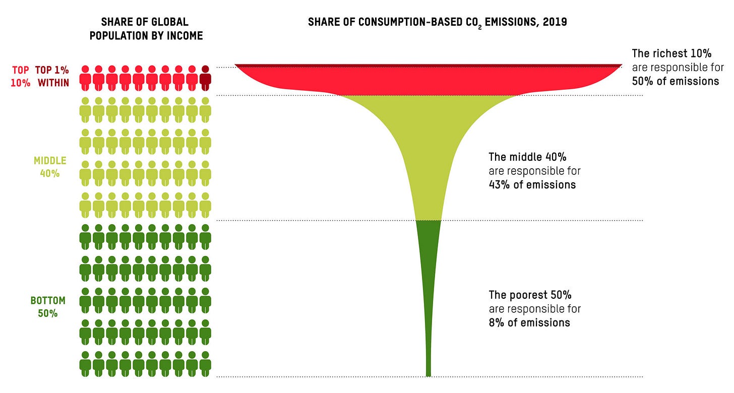
Cumulative Co2 emissions between 1990 and 2015 associated with lifestyle consumption plotted against world population arranged by income. Source: Oxfam/SEI 2023 Carbon Inequality Report
Strangely, one of the most ignored aspects of carbon footprints is also one of the most obvious. Higher the income, higher the carbon footprint, whether it is individuals or countries. Prosperity is the primary driver of carbon emissions, it directly correlates with higher consumption and higher emissions. The latest carbon inequality report by Oxfam quantifies this and the results are not really surprising but shocking nonetheless. The richest 10% of the world population produce the same amount of emissions as the rest of 90%!
Here are few more shocking insights from the report—
The richest 1% are emit twice as much the emissions of the entire poorest 50% of the population
Since the first IPCC Report was published in 1990 when the world officially decided to act on climate, emissions rose by 60% till now. Since 1990, the richest 10% were responsible for over 50% of the emissions in the same period.
The global carbon budget is being rapidly depleted, not for the purpose of lifting all of humanity to a decent standard of living, but to a large extent to expand the consumption of a minority of the world's very richest people.
In 2019, the richest 1% were responsible for 16% of global carbon emissions, the same as the emissions of the poorest 66% of humanity (5 billion people).
The rich or merely affluent, it turns out, are actually the ones blowing through the world’s carbon budget - Read more at How affluent people can end their mindless overconsumption
According to the 2020 report by Oxfam, if your household income is more than 38,000$ or ₹28,00,000, you are in the 10% richest slot. Here is a clear and immediate case for personal carbon footprint reduction— the affluent need to either stop destroying the planet[*] or find sustainable ways to indulge in luxury without putting the whole planet and humanity in peril.
One could simply recognise the futility and cruelty of going after the low hanging fruit that is poor people’s negligible carbon footprint and instead invest in bringing about systemic changes like energy transition that will bring down the overall emissions without disrupting the lives of those who didn’t create the problem.
You can read the updated carbon inequality 2023 report here or find the highlights here and you can explore the key drivers of emissions here.
7. Region wise global emissions - aka which countries disastrously dipped into the common pool of global natural resources?
Global per capita emissions average vs country wise per capita emissions in 2017. Source: Our World in Data
Our atmosphere and natural resources are a common pool for all countries and people to share equally. If there were no limit to these resources and no consequences to endlessly exploiting the resources, wouldn’t have been any problem. But we know the resources are limited, as is the amount of carbon dioxide that can be put in the atmosphere. Ideally, the carbon budget would’ve been shared fairly so everyone could develop. But that’s not how it played out in reality.
If we divide the total allowed carbon budget equally among all population and compare that average to the real world per capita emissions, we can clearly see who’s over-consuming and who’s under-utilising their fair share of carbon budget. There’s a clear north-south divide and developed-developing country divide here. Explore per capita emissions in comparison to global average in detail of here.


According to another study referred above, Global North i.e the handful of developed countries and EU together contributed a whopping 92% of emissions leading to today’s level of global warming. While Global South - the entire continents of Africa, Latin America and Asia - have contributed only 8% of global excess emissions. And yet, according to the Climate Vulnerability Monitor, the South suffers more than 90% of the costs of climate breakdown, and 98% of the deaths associated with climate breakdown, as per Jason Hickel, the author of the paper. You can see the published paper here, pdf here.
*****
In conclusion, a poor individual anywhere in the world or a poor country that is yet to develop has negligible emissions yet they are being short changed by those higher above them on the economic ladder. And that’s why climate change is not a simple technological issue, it is fundamentally an inequality issue. All of us are not in the same boat. We’re simply in the same storm. And some are much more capable of both inflicting harm and then shielding themselves from the harm that they single-handedly created. Understanding this difference and the embedded inequalities is crucial if we are to address climate change fairly.
Fin.
Value explainers like this? They’re made possible by paid subscribers. Climate Matters is a 100% reader-funded publication, and every subscription makes a difference.
So do consider making a one time contribution via Instamojo(Indian cards) or PayPal(International Cards) or becoming a paid subscriber(only works for cards out of India) to support independent climate journalism.
Found this article useful? Forward it to your friends and family.


Superb piece again! You are doing great work here.
Thank for sahring detailed information ...